Action Items – Centralizing Work in One Place
Context
When we launched the new Home page, our goal was to make it the place where accountants start their day. For users of the Practice module, the Action Items widget became the centerpiece. It’s the only widget that’s expanded by default, and it’s the first thing they see when they log in.
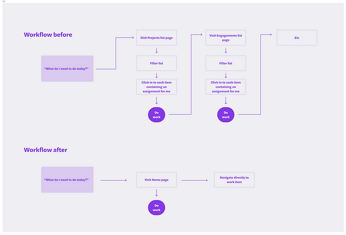
Before this feature, users had to dig through multiple lists (Projects, Engagements, Client Requests, Draft Bills) to figure out what needed their attention. The process was scattered, manual, and stressful.

Problem
Our users asked a simple but critical question every morning:
“What do I need to do today?”
The existing workflow forced them to piece together the answer across different lists and filters. It was inefficient and overwhelming, and it put too much cognitive load on the user.
Solution
I designed the Action Items widget as a scan-friendly, prioritized list of everything that needs your attention, with clear next actions. At a glance, you can see what’s due, what’s overdue, and where to go to resolve it.
To further reduce friction, I introduced a Recommended sort option. While users can still sort by client or due date, Recommended applies a behind-the-scenes urgency score that considers factors like work type, deadlines, and overdue status. Even if the formula isn’t perfect, the intent is clear:
“We’ve curated this list for you. Start here.”
This shifts the mental burden away from the user, making the widget feel more like a trusted assistant than just another to-do list.
Collaboration
I partnered closely with our product trio — myself (Design), our PM, and our Tech Lead — to define the high-level solution. We kept engineering looped in early, incorporating their feedback on feasibility. Sales wanted an early screenshot for their decks, so I ensured our designs were polished enough to support external storytelling. Other designers and leadership were kept in sync, since this widget sits at the heart of the Home experience.

Iteration
Because we had to move quickly, I iterated through multiple versions using internal reviews and occasional customer validation.
-
Early prototypes tested grouping and metadata strategies.
-
Customer feedback confirmed the value immediately:
“Yes. That. We need that.” – Customer during prototype review
-
Later iterations focused on scan-ability, consistent patterns, and interaction alignment with the rest of the product.

Final Design
The final widget is expanded by default and sits at the top of the Home page — the daily starting point for staff.
-
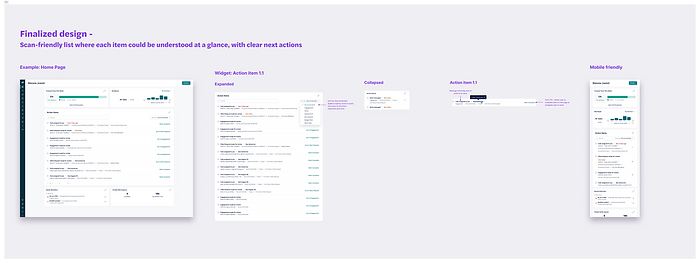
Scan-friendly list: Each item has just enough context to be understood at a glance.
-
Inline actions: Critical items like “Mark Complete” can be resolved without leaving the page.
-
Navigation shortcuts: Users can also jump directly to the relevant area of the app.
-
Smart prioritization: The Recommended sort option applies urgency scoring to guide users toward their most important work.
-
Collapsed state: Lightweight view for secondary placement.
-
Mobile-friendly: Optimized design ensures Action Items works seamlessly on phones, where quick scanning is essential.
Impact
-
Action Items is now the first thing every staff user sees daily in the Practice module.
-
Reframed the product around action, not navigation.
-
Reduced friction by eliminating the need to hunt across modules.
-
Established a design pattern that influenced other workflow widgets (Workload, Time Allocation, Needs Attention).
-
Created a strong value story for Sales, highlighted in demos and decks.
Reflection
Action Items wasn’t just about creating a widget — it reset the center of gravity in our platform. By reframing work around a single hub, I reduced cognitive load for staff, gave sales a differentiator, and created patterns that informed every other workflow widget.
This project shows how I design for both immediate usability and long-term scalability — solving today’s pain while laying a foundation for the future of the platform.