Contextual Action Bar (Design System Component)
This component is a good example of how I approach design systems at scale: clear purpose, constrained usage, and opinionated guardrails that reduce ambiguity for both designers and engineers. My goal with this Action Bar was to unify how bulk actions appear and behave across data-heavy surfaces, so teams could ship consistent interaction patterns faster.
Overview
The Action Bar is a contextual control surface that appears when users select one or more items.
It provides quick access to bulk actions without taking up persistent space in the UI. Once all items are deselected, the Action Bar disappears.
Use this component when users need to review, modify, or take action on multiple selected items at once without navigating away from the current view.
.png)
Variations

.png)
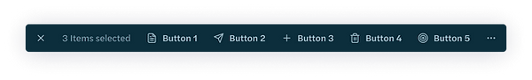
Basic — Text only actions
With Icons — Icons may be used when they increase scannability or reflect industry-standard actions (e.g. trash, export, download)
.png)
With Overflow — The “More” menu should be used when there are > 5 actions or when lower-frequency actions need to remain accessible without visual clutter
Usage Guidelines
-
Appears only in bulk selection mode
-
First actions reflect highest frequency usage
-
Do not use for page-level navigation
-
Dismisses automatically once selection clears
Accessibility
-
Screenreader announces “Bulk action mode enabled” on appear
-
Dynamic selection count announcements
-
Escape closes the bar
-
Icons must have text labels unless universally recognized
My Contribution / Impact
-
Defined component behavior and interaction rules
-
Wrote guidance and guardrails to prevent misuse across products
-
Partnered with engineering to ensure scalable implementation
-
Improved consistency in bulk workflows across data-heavy surfaces